The stock market is very sensitive to a calculus concept called “the second derivative.” It’s not that hard to grasp, and I’m certain that if you keep reading you will have no trouble at all understanding it.
How fast are we going? In a car, we measure that speed in miles-per-hour (MPH) here in the USA. Think of your speed as the “first derivative.” Now think about how it feels to be going 70 mph in three different scenarios:
- Cruising at 70 as you drive across Kansas.
- Accelerating from 0 to 70 as you enter the freeway after a rest stop.
- Slamming on the breaks when you see an idiotic deer frozen in your headlights while going 100.
In scenario 3, at some point your speed will drop to 70 as you break. But it feels completely different from the other two 70’s, right? That’s the second derivative in action. In each case, you are going the exact same speed. One is fun as you zoom up. One is dull as you cruise. And one is harrowing as you break and pray that you won’t die.
The same is true for our economy. The actual speed is not as important as how fast the speed is changing and in which direction. After a recession, the stock market rockets up. As the economy cruises along at a steady speed, the market can continue to creep upward. When a recession sets in and the economy decelerates rapidly, the market falls.
So, how do we measure the speed of the economy? You can measure it in various ways. The “official” way is to use Gross Domestic Product (GDP), but GDP is unsatisfying because it is only published once per quarter and with a long delay.
Savvy investors like to use the amount of money that the federal treasury is raking off of paychecks each day because that number is published every business day. It is also a good speed measure since the number of people working and getting paid is a very good indicator of how well the economy is doing.
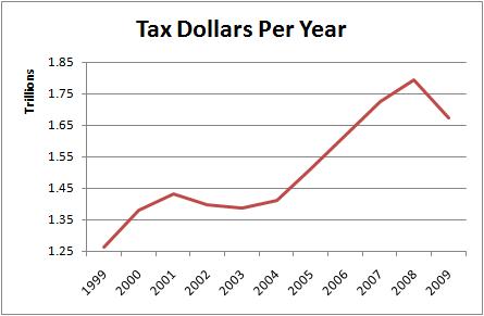
So, instead of miles-per-hour that we use in our car, let’s use tax-dollars-per-year to measure the speed of our economy:
So, in 2007, we were sailing along at a bit over $1.7 trillion dollars per year. Not bad, right?
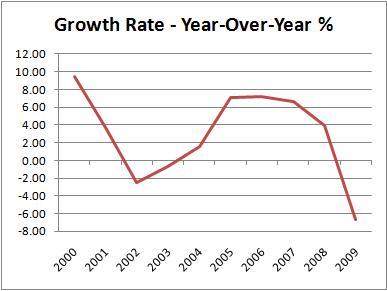
Now let’s calculate the second derivative. Don’t panic! It’s not that hard. We don’t even need to use calculus. In fact, we are just going to do simple arithmetic. Let’s look at the chart first:
The chart starts at the left just under 10%. That’s how much we sped-up in 2000 compared to 1999. Here is the calculation:
1999 taxes = 1,261,750,000,000
2000 taxes = 1,381,625,000,000
1,381,625,000,000 – 1,261,750,000,000 = 119,875,000,000
So, the treasury raked in $119,875,000,000 more dollars in 2000 than it did in 1999. To find the percentage, we divide that gain by the 1999 total:
119,875,000,000 / 1,261,750,000,000 = 9.5%
Easy, right? Now when we do that calculation for each year, and then plot it on the chart above, we get a second-derivative chart. A chart that shows us how much the economy accelerated or decelerated from year-to-year. That’s all there is to it.
So, on the first chart, it didn’t look like anything important was happening in 2007. But on the second chart, it was clear that tax collections were in decline. That was a good early warning for the recession which was about to begin.
Note: the charts above are based on the federal government’s fiscal year, which begins in October, rather than January.
Now you are thinking: I can’t wait until the end of the year to see what this year’s growth rate is. I need to know right now! How are we doing so far this year!?
In the discussion above, we were only glancing down at our speedometer once a year. But we can do it more often than that. In a car, you can glance at your speedometer any time you want because it is constantly telling you your speed. In the economy, the Treasury Department only tells us how much money it is raking in once every business day. So, the most frequently we can check is about 251 days per year. We can’t check the speed on weekends or holidays.
In order to calculate that, all that we need to do is add up the tax dollars raked in over the previous year ending with today. So, if today were June 1st, we would proceed backward adding up all the numbers from each Treasury report until we got to June 2nd of the previous year. Then tomorrow, we would do the same thing, only we would count back to June 3rd. Each day, the year-long period shifts forward by one day, right?
Once you do a total over the past year, you need to go back to the same day of the previous year and repeat the same calculation. So, the first calculation would be June 2, 2008 through June 1, 2009. The second calculation would be June 2, 2007 through June 1, 2008. Then you calculate the growth percentage for those two year-long periods just like we did above. If you do that every day, and plot the percentages on a chart, you can see exactly what the second derivative is on any day.
We produce several charts like that. However, since there are thousands of business days during this period, it is cumbersome to put them all on a single chart. So instead, we take a sampling and only plot a point on the chart every so many days. This still gives you an accurate outline of the curve. Here is our “Daily Growth – All” chart with a 90-day delay. Subscribe to see the real-time version:

