The Social Security Administration reports the revenue it receives from payroll-tax receipts annually. It also has interest income, but here we will only look at the revenue from tax collections in order to judge the strength of the national job market.
The first chart shows the nominal payroll-tax receipts going back to the beginning of the SSA in 1937 (click chart to enlarge):
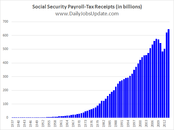
Social Security Payroll-Tax Receipts
The next chart shows the year-over-year growth rate:
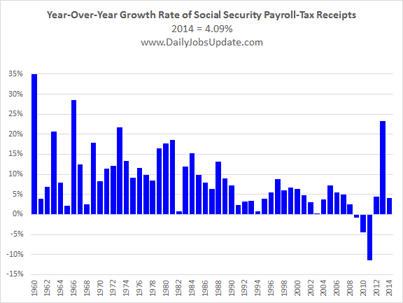
Year-over-year growth rate of
Social Security payroll-tax receipts.
The negative numbers for 2009, 2010, and 2011 were due to the Great Recession tax-cuts. And the big spike in 2013 was from the tax-cuts expiring thereby creating an easy year-over-year comparison. The 4.09% growth-rate for 2014 was the first solid, apples-to-apples comparison since 2008.
The data for these charts come from this page on the Social Security Administration’s website. You can download the Excel spreadsheet that I used to make the charts here.
While many people like to look at this data, the withholding-tax data published by the Treasury Department is far superior. Read my view of the FICA tax data.
Note to bloggers: You may use these charts as long as you link back to this website. No hot-linking please.